CoinDesk brand refresh

The glow-up.
Role: Creative Director · Bullish
Scope: Visual Identity · Brand Strategy · Design System · Stakeholder Alignment
Directed a full visual identity refresh for CoinDesk, unifying the brand across its entire product ecosystem. Work spanned a new color palette, updated typography, and a logo streamlining effort paired with an expanded visual expression system built on logomark geometry.
The result: a fresher, more versatile brand with consistent reinforcement of the CoinDesk master brand across all offerings, cleaner layouts, and a more playful, elevated personality.
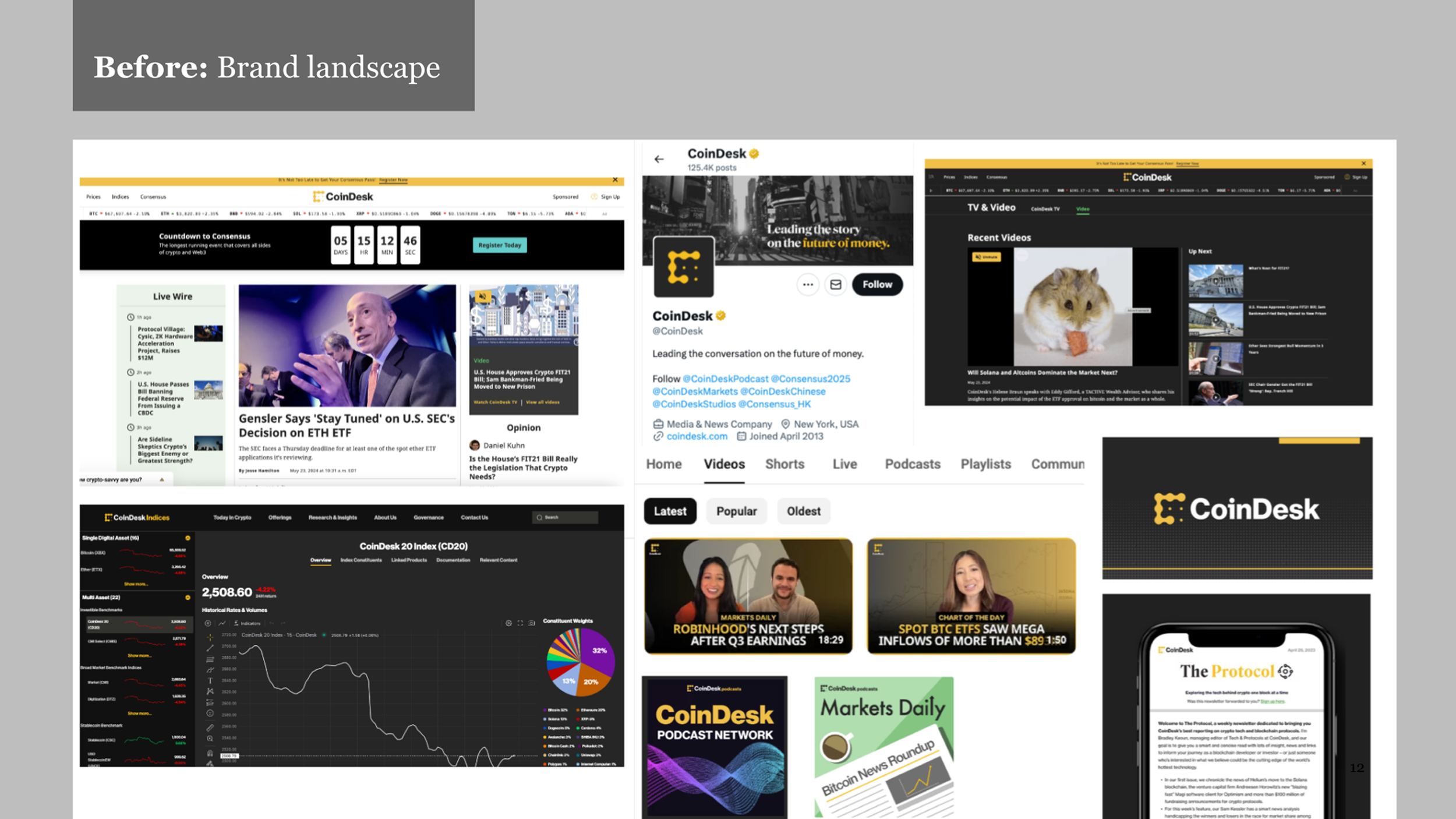
Inherited brand landscape
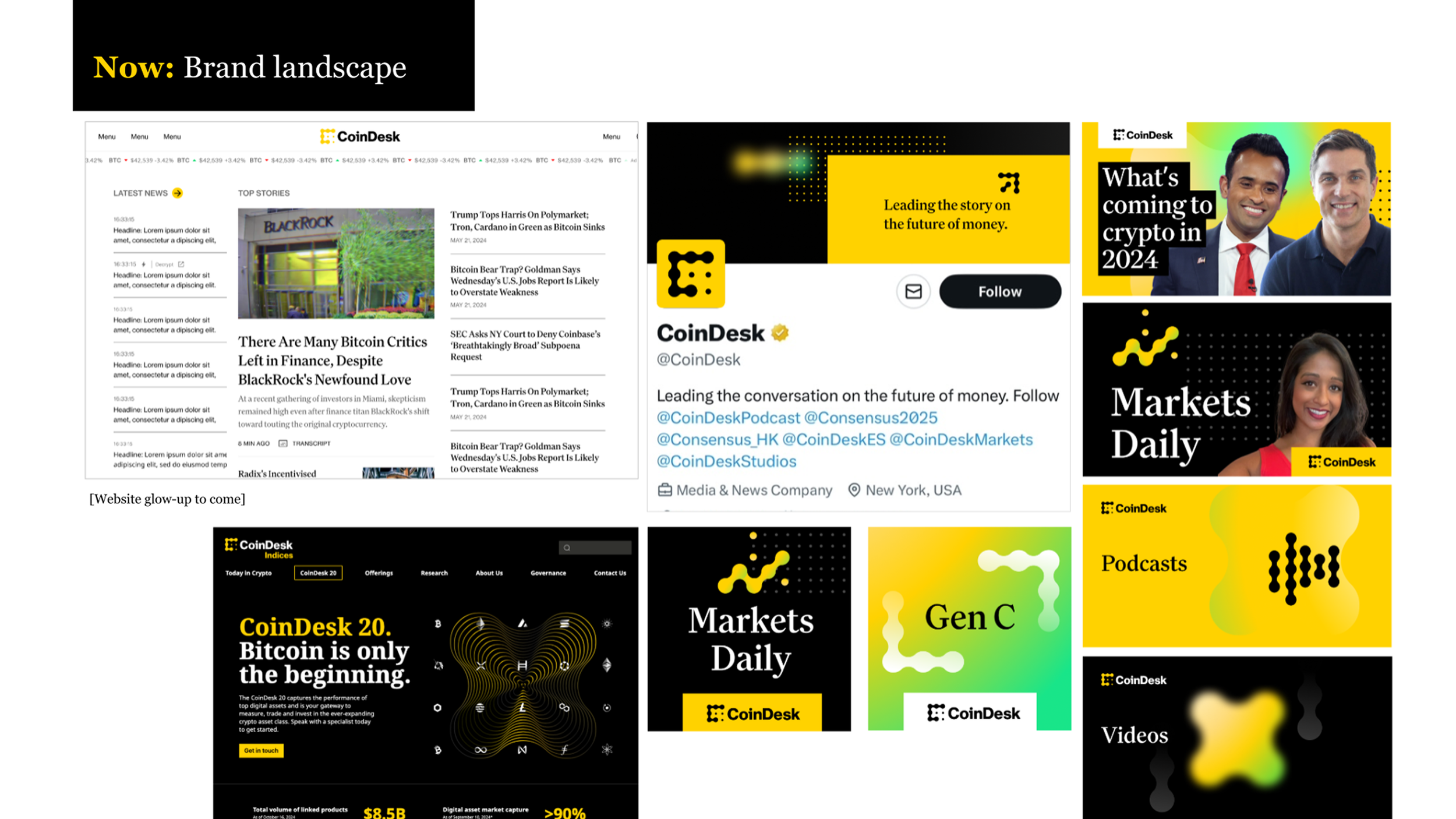
Refreshed brand identity
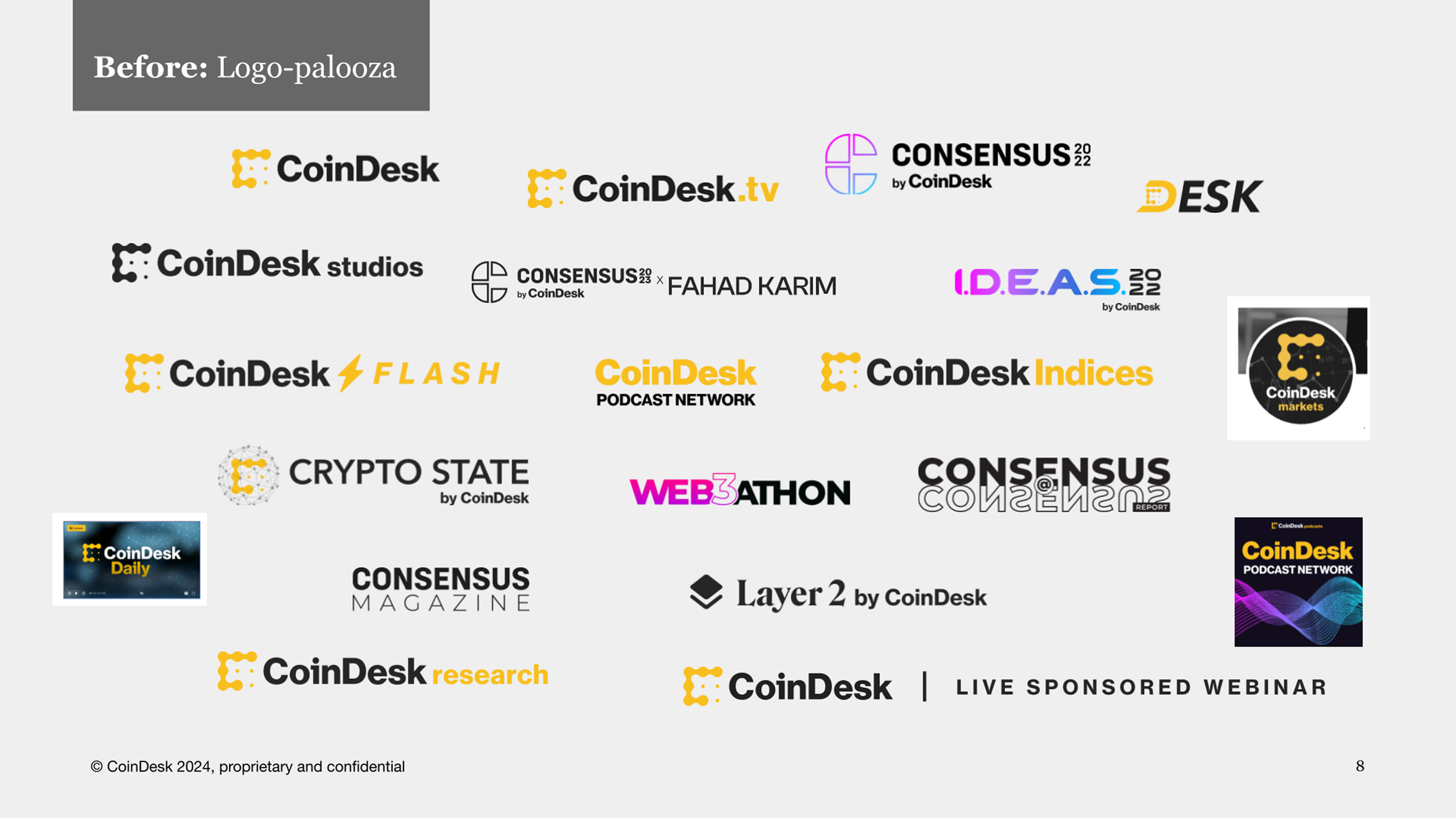
Inherited a messy logo system.
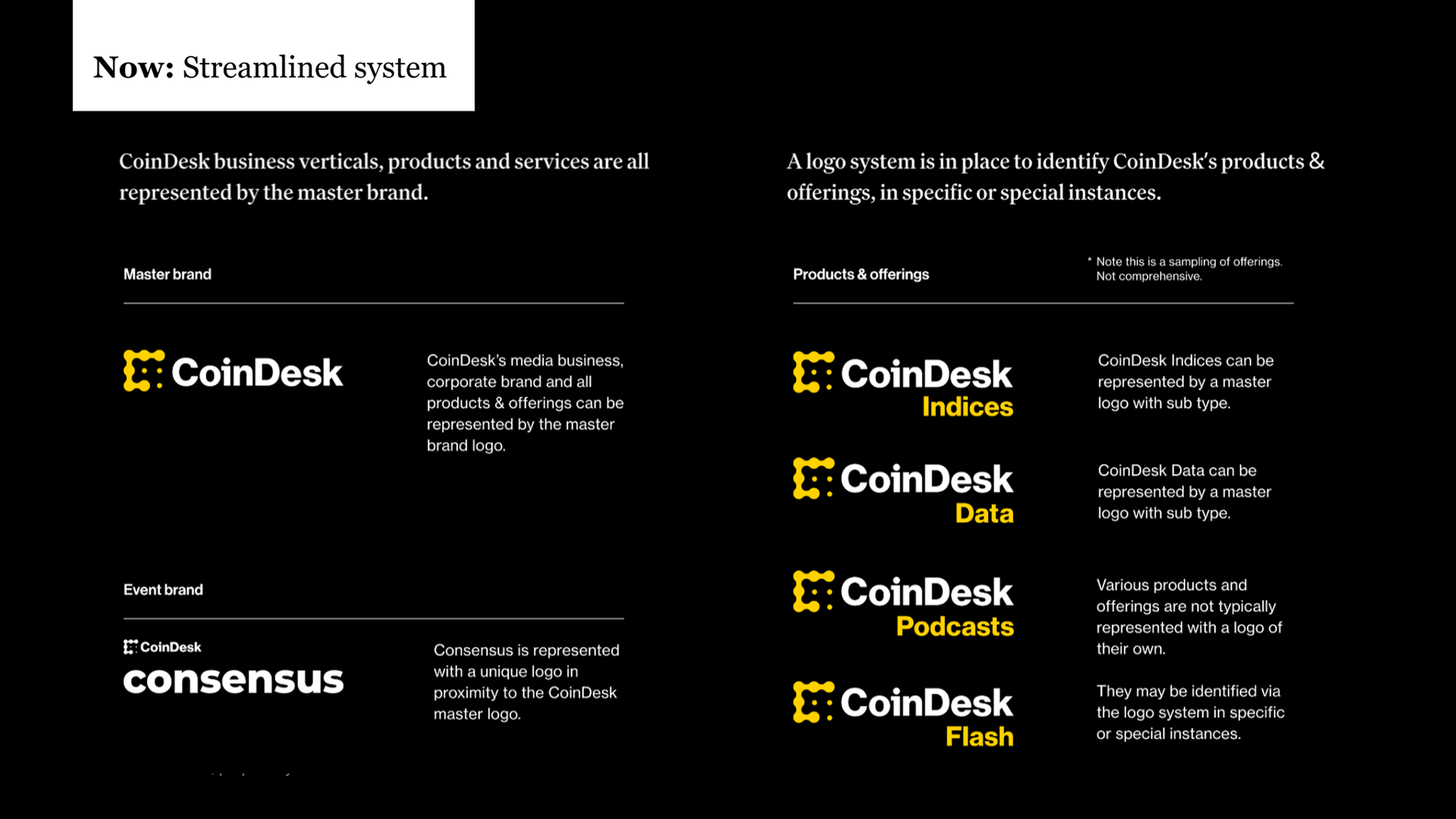
We streamlined the master brand, business verticals, products, services and offerings into a coherent logo system.
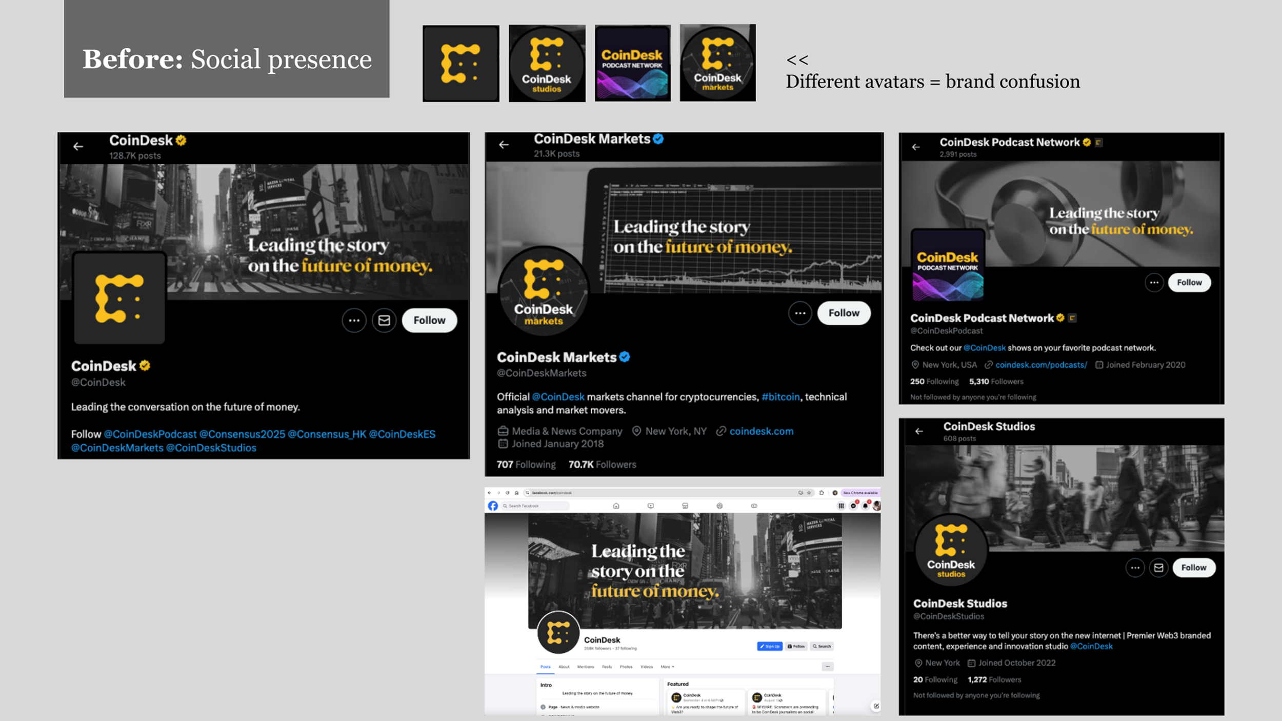
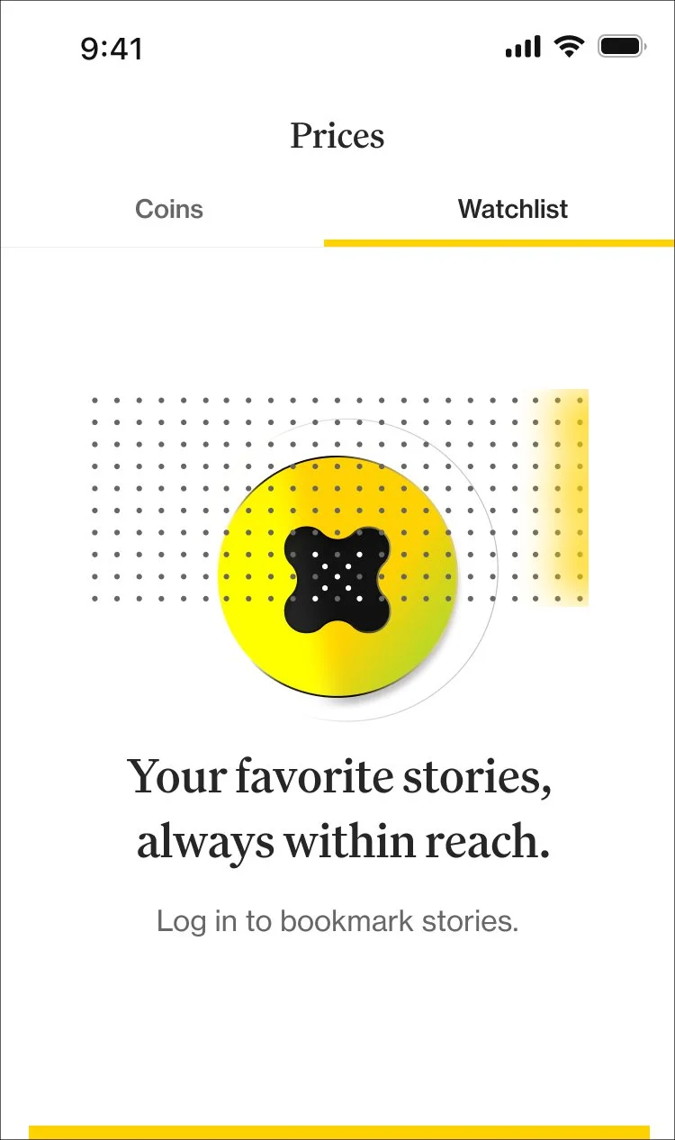
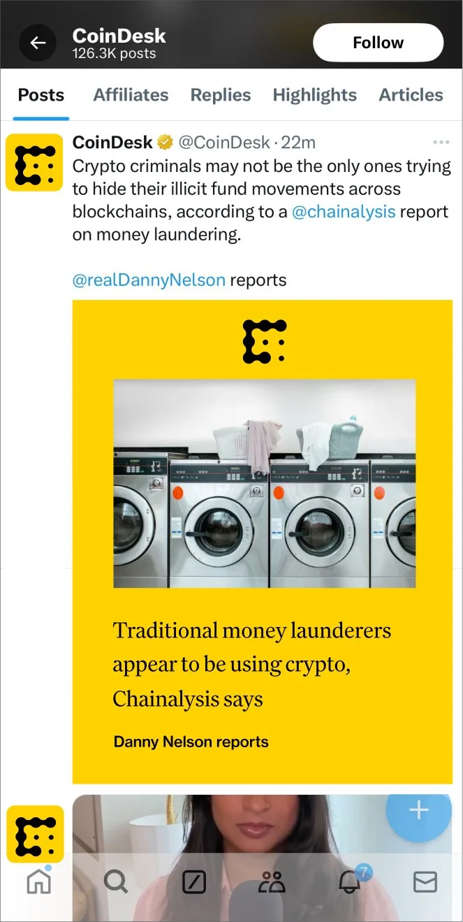
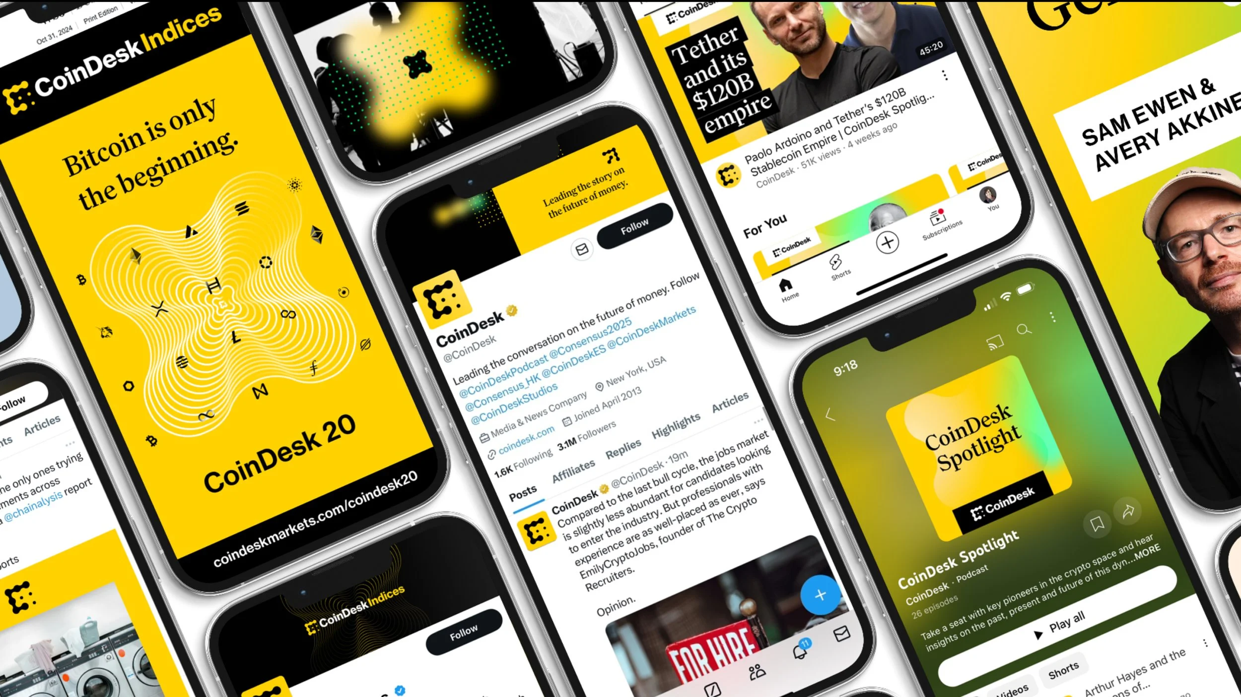
Inherited social media landscape
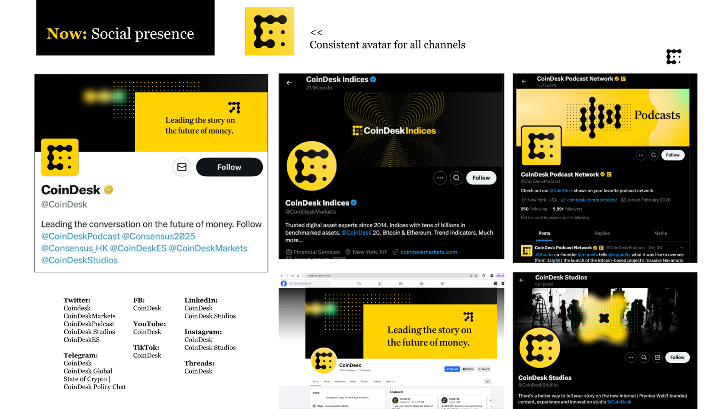
Refreshed with streamlined avatar, new graphics
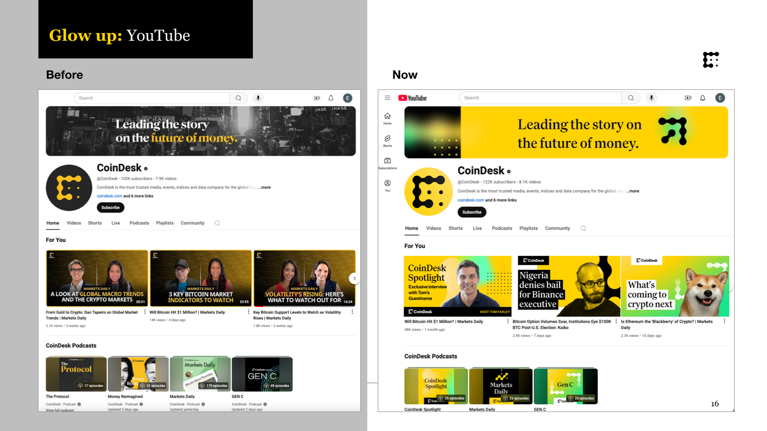
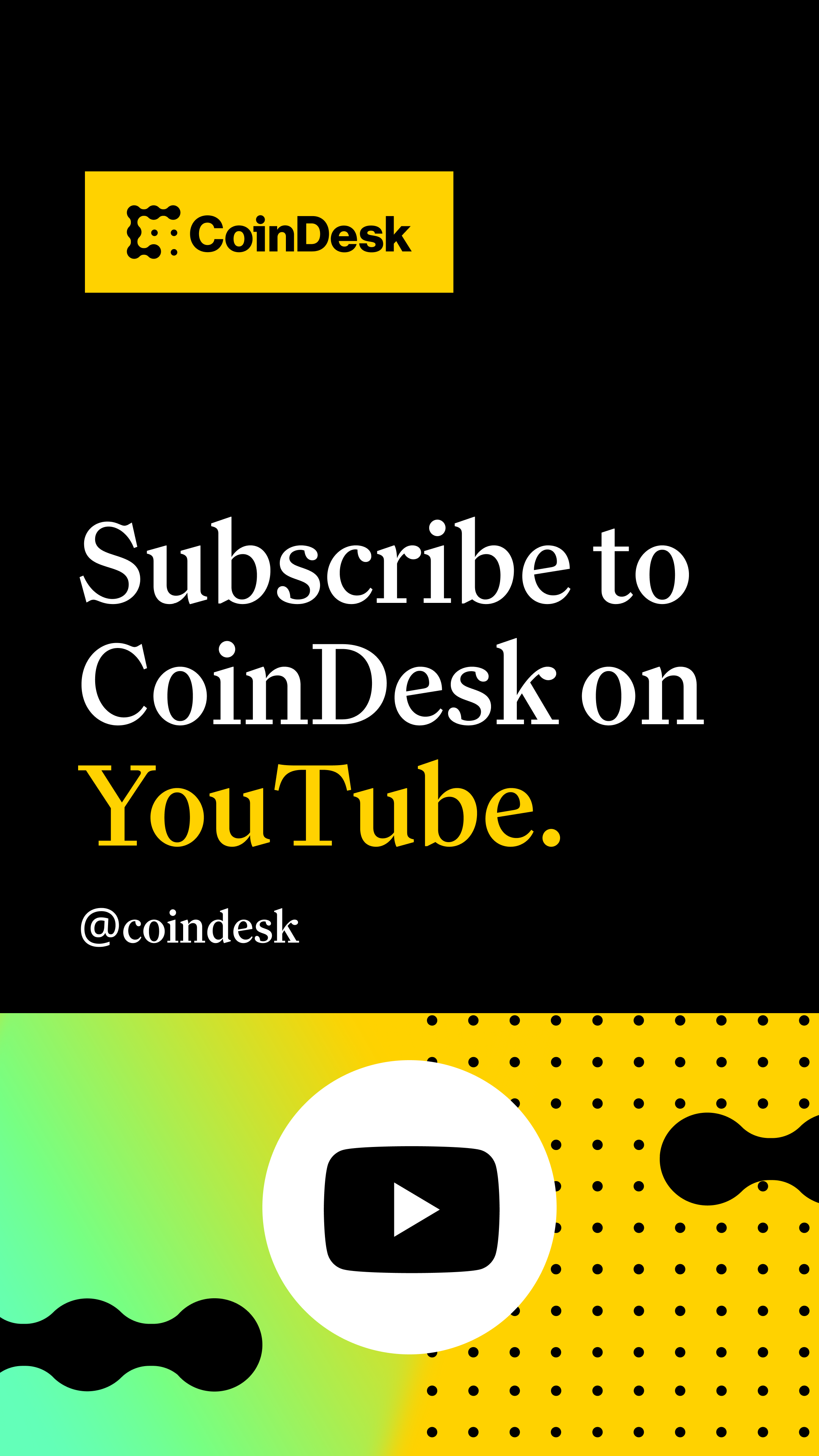
Youtube before and after
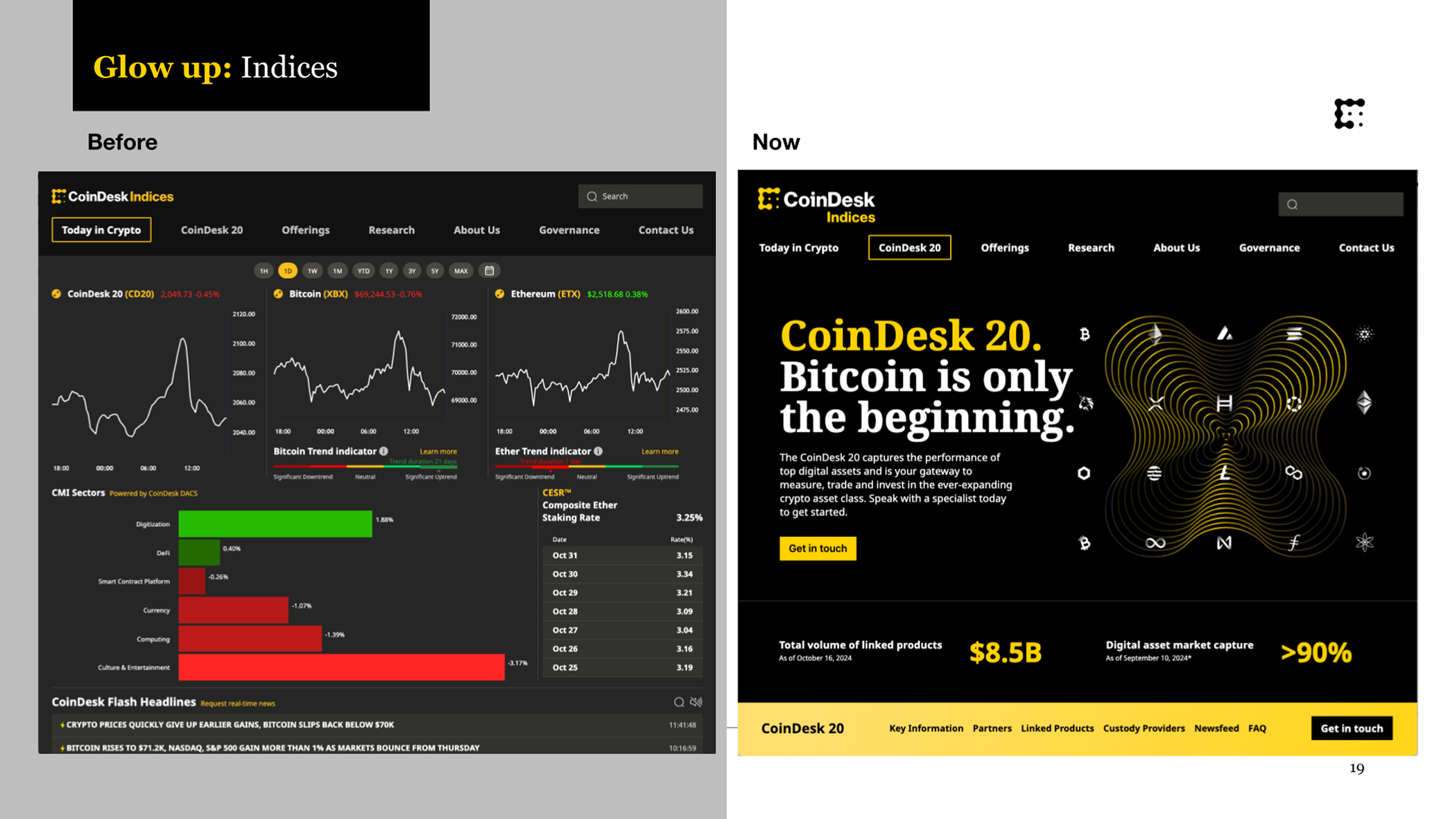
CoinDesk Indices before and after
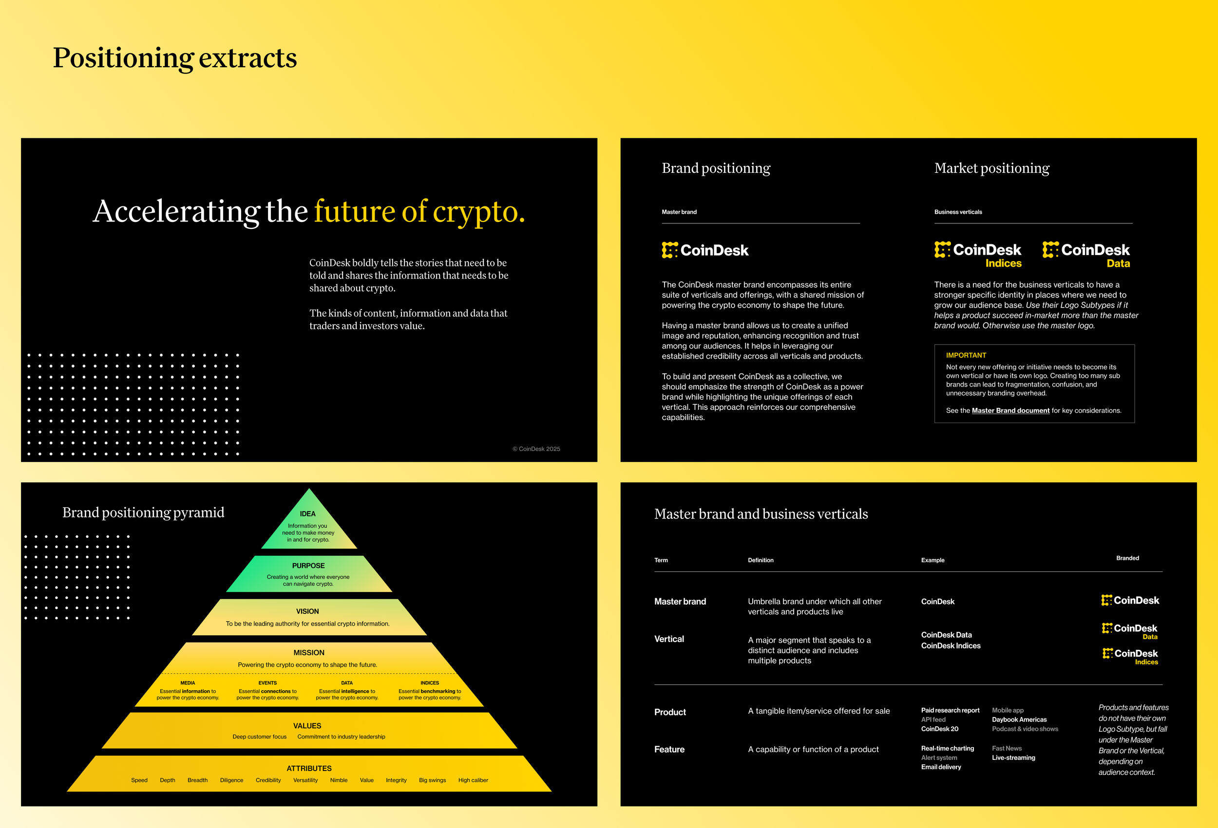
Brand book excerpts from new positioning
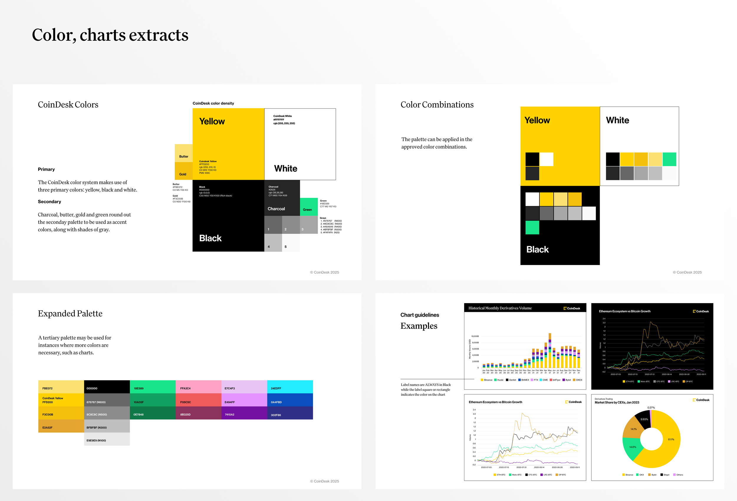
Brand book excerpts with color and chart guidelines
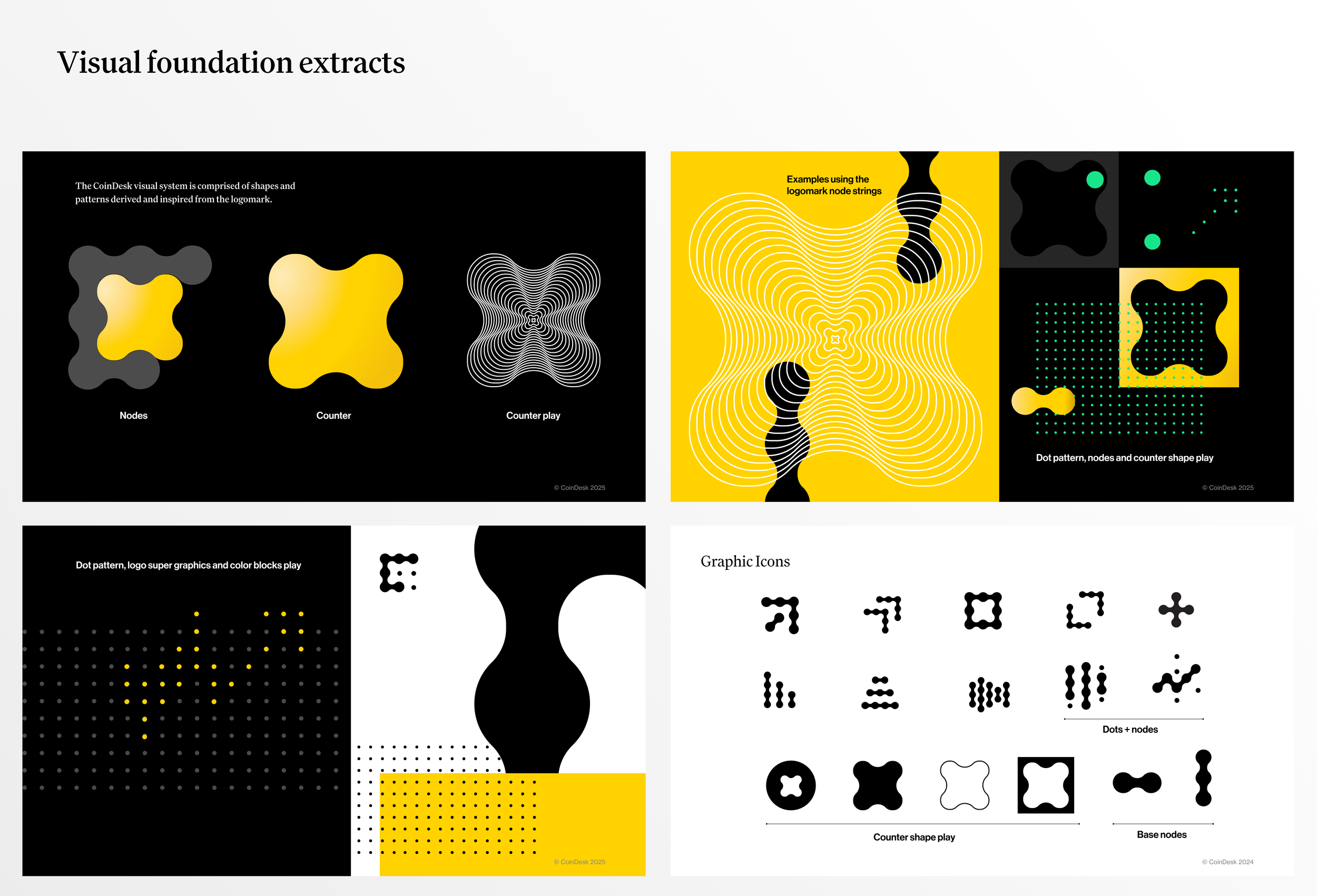
Brand book excerpts with visual foundations
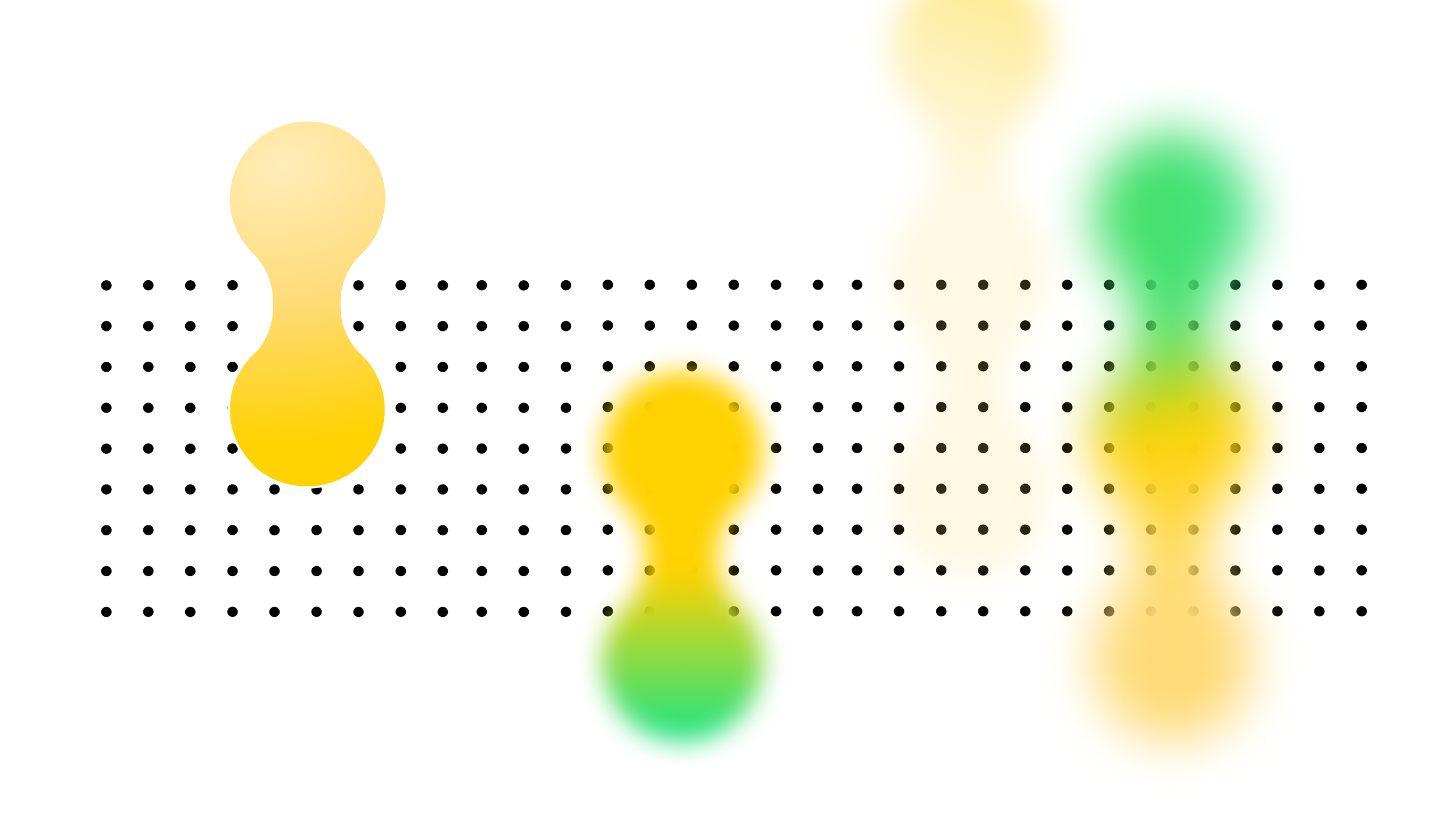
The icon system grew directly out of the logomark, using its nodes as the core building block. Grouped and scaled, they form charting and data icons, while the counter shapes carved from the logo extend the system further. The result is an expressive, unified graphic language.
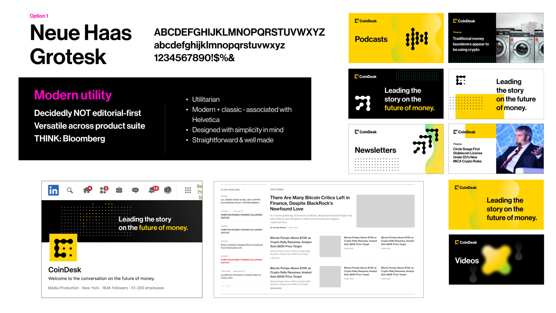
Typography explorations
Typography was treated as a brand decision, not just a design one. Stakeholder workshops across editorial, web, multimedia, and executive teams helped define what CoinDesk needed to feel like. We wanted the Atlantic's brand beauty, Bloomberg's utility, and a crypto-native irreverence fused together. From there, three directions were explored. We landed on the Family typeface collection. Family is traditional without being fussy, editorial without being precious, and versatile enough to carry everything from breaking headlines to product UI.
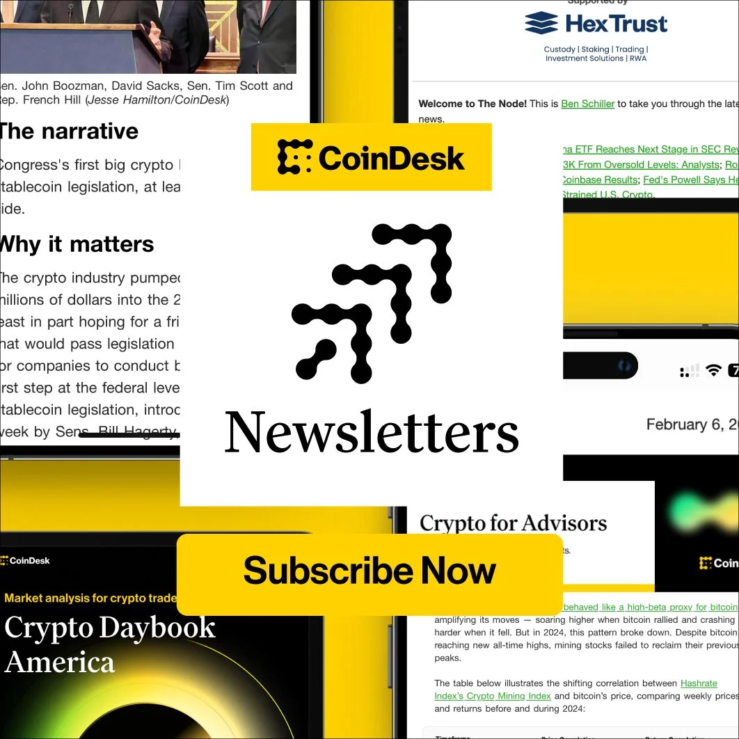
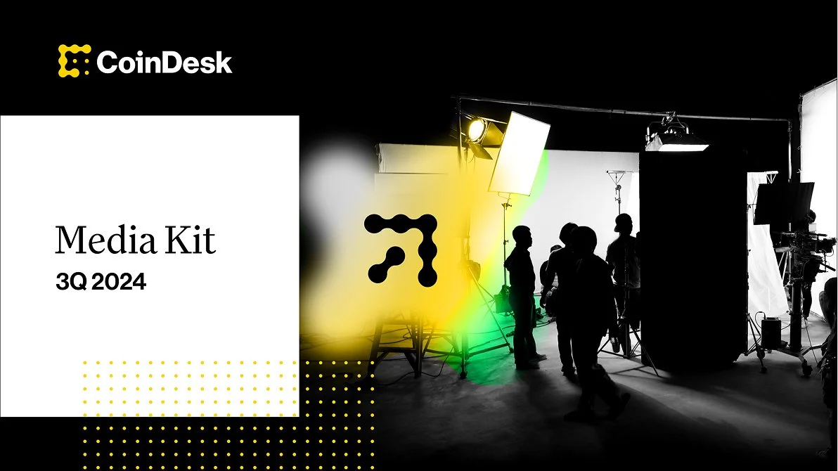
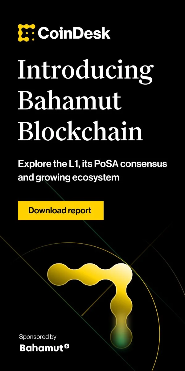
All together now.
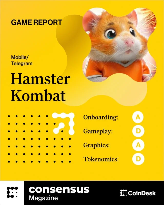
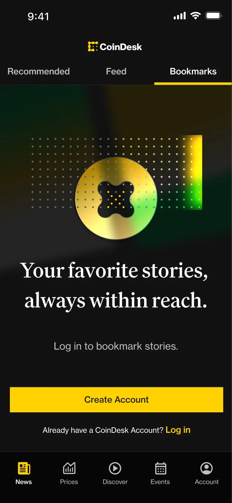
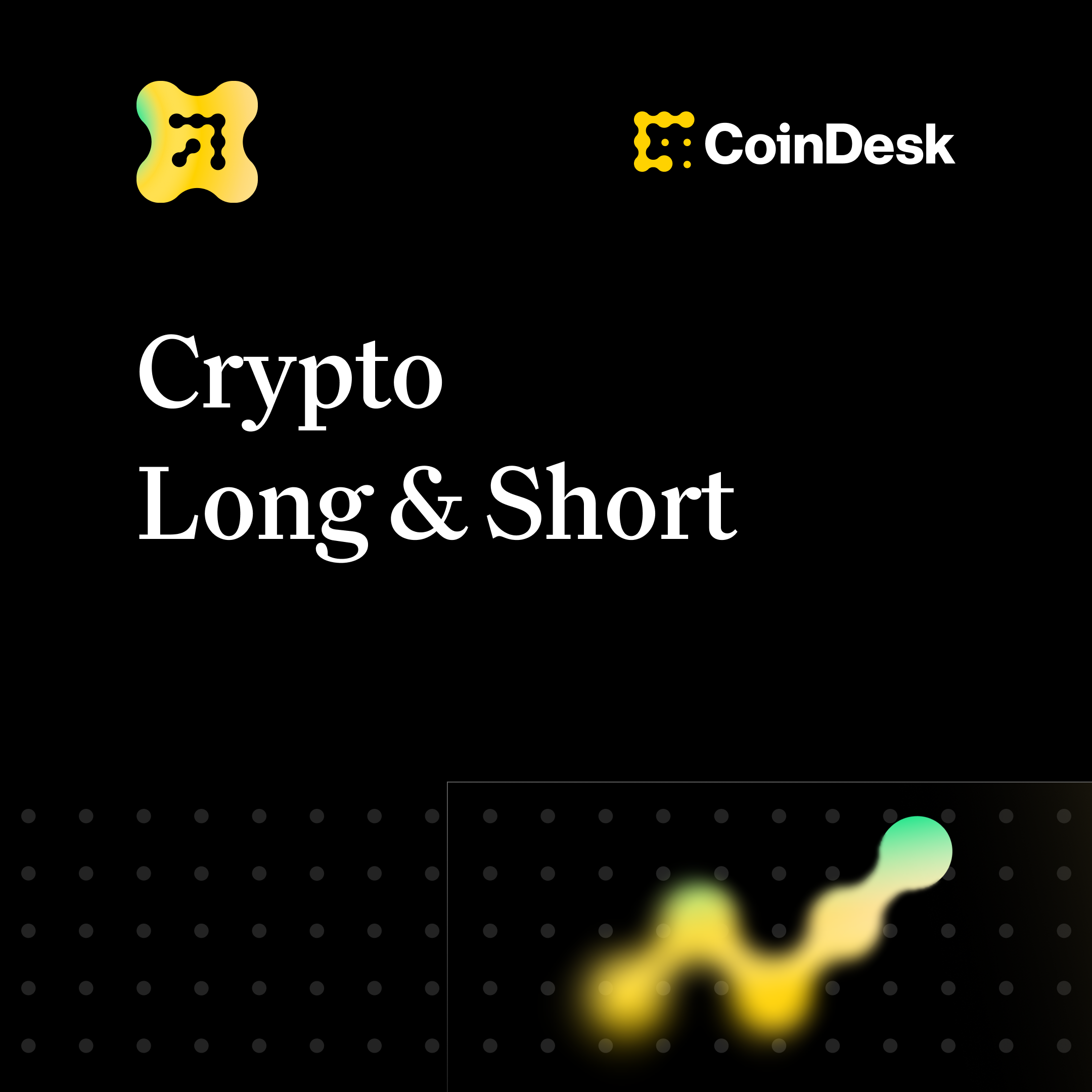
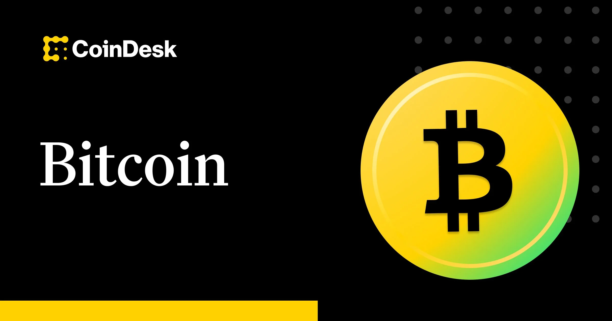
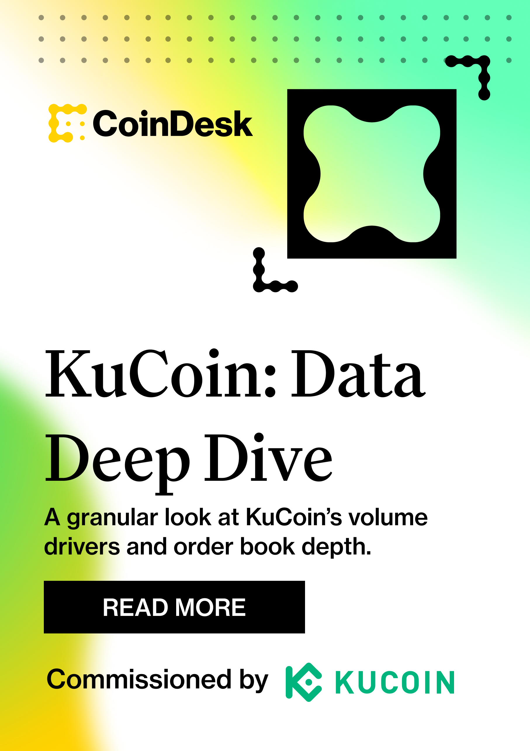
A smattering of brand expressions.